Illustrations
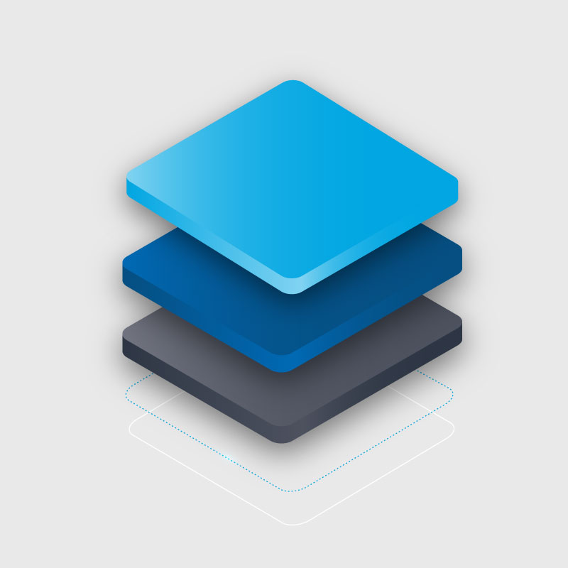
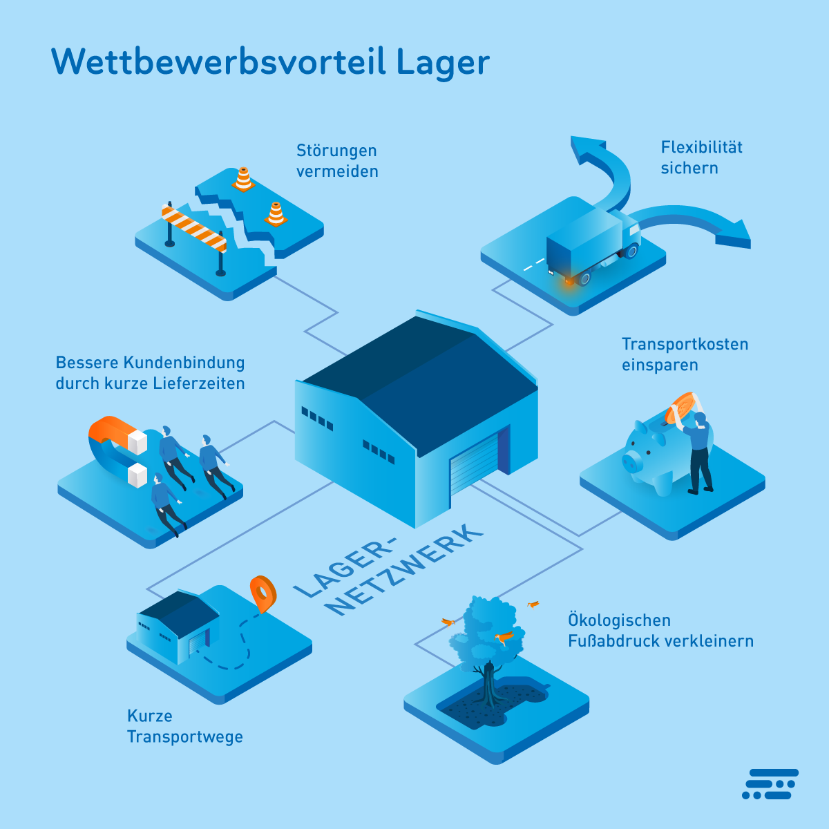
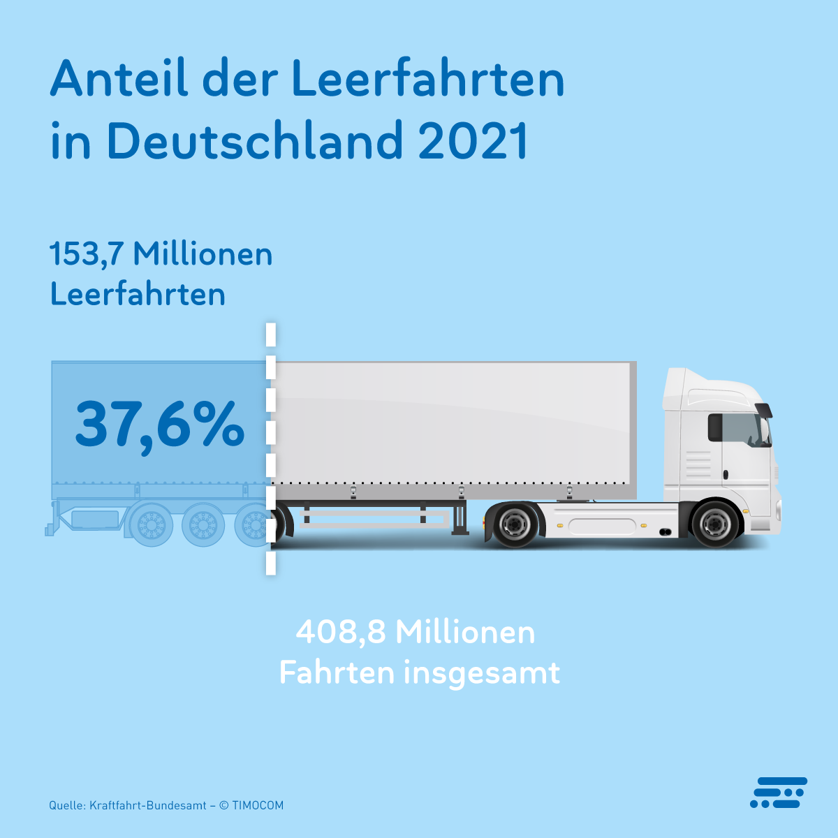
The isometric 3D style best reflects the core of the brand and gives us the opportunity to present complex themes in a simple and modular way. For less complex content, 2D visualisation can also be chosen as an alternative.

In terms of colouring, the graphics are designed to work on different backgrounds.

Connectors serve as visualisation of a data exchange.

Rounded platforms can be related to applications or used to create small scenes.

Characters are used to add empathy to the compositions, but simplified so as not to distract much attention from the objects and processes.
Examples of use


